
Reviews: Whitney Biennial
By Sarah Douglas
Published: April 29, 2010
“2010” at the Whitney Museum of American Art, New York
Through May 30, 2010
What kind of biennial is "2010"? First let’s dispose of a silly notion — that this is the women’s biennial. Yes, 51 percent of the participants are female, and some of these are represented by top-notch works: Aurel Schmidt’s painstaking drawing of a hipster Minotaur, his body composed of cigarette butts, beer cans, cash, a Blackberry, and other urban signifiers; R.H. Quaytman’s deliriously self-referential paintings; and Kate Gilmore’s video of herself, demure in a red-and-white polka-dot dress and girl-next-door ponytail and literally — in a pointed take on both feminism and modernism/formalism — bursting out of the white cube, to name just a few. But is this the women’s biennial? No. That’s a preposterous notion largely invented by the press, one that manages to be insulting both to women and to biennials. To merely crunch the numbers is, ultimately, tedious and reductive.
The synecdochic key to the show is an artwork whose inconspicuousness belies its centrality to the overall ethos. Just beyond the second-floor stairwell is Conceptual-art titan Michael Asher’s contribution, or rather noncontribution. Asher proposed that the museum stay open 24 hours a day for the duration of the biennial. Built into his proposal was its impossibility, budgetarily speaking. And so the piece consists of two adjacent wall labels, one explaining Asher’s idea, the other telling viewers the museum couldn’t make it happen.
Something of the modesty of this almost-piece pervades "2010": It is the big idea that didn’t happen. And that’s not a bad thing. No grand organizational theme (see Altermodern, under Tate Triennial) is imposed here. Which is not to say that hot topics — politics (in particular, disaffection with capitalist America and its recent wars), aesthetic reevaluations of modernism, and that oldie but goodie the body — aren’t floating around. But the show’s curators, Francesco Bonami and Gary Carrion-Murayari, zeroed in on how these motifs are filtered through internal states.
Also missing is the grand explosive gesture: Urs Fischer blasting through the walls in 2006, the exhibition sprawling into the uptown Armory building in 2008, with performances and other events. In the biennial equivalent of pop music’s transition from punk rock to emo, smallness (but not tweeness) now rules — with 55 participating artists, fewer than in previous years — as does a certain subdued mood, discounting such exceptions as Marianne Vitale’s antic video of herself as a sort of military officer, barking nonsensical orders, and Piotr Uklanski’s massive macramé. Could this be recession aesthetics?
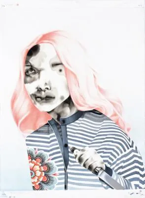
The show makes a strong argument for photojournalism’s interacting with art. In the context of Nina Berman’s photo series depicting a soldier disfigured by a suicide bomber in Iraq and Stephanie Sinclair’s gruesome shots of Afghan women who have self-immolated as a form of protest, the stained, splotchy faces in Storm Tharp’s washy gouache portraits begin to evoke abrasions or burns. The theme of bodily disfigurement is continued elsewhere in the juxtaposition of Thomas Houseago’s hulking, seemingly hacked-at sculpture of a crouching figure with David Adamo’s installation comprising an ax, its wooden handle cracked and eroded, stuck into the wall and surrounded by whittled-down canes. Adamo’s ax appears to have done a number on Houseago’s statue, while the canes evoke missing limbs.
Not that "2010" doesn’t make missteps. I wanted to like the Bruce High Quality Foundation’s installation: a hearse, headlights ablaze, playing on its windshield clips from various TV shows and movies to a soundtrack ranging from "A Whiter Shade of Pale" to the "Star-Spangled Banner" and including a voice-over recounting an aborted love affair with the U.S. ("We fucked America to make America disappear"). But the work comes off as juvenile, bathetic, too tongue-in-cheeky by half. One marvels that light fare can be so heavy-handed; Josephine Meckseper displays a far more nuanced take on capitalism’s ills in her brooding video meditation on Minnesota’s sprawling Mall of America. And although Lorraine O’Grady’s sepia-tinged photographs of Michael Jackson and Charles Baudelaire convey something ineffable about the romantic nature of celebrity and America’s worship of it, their pairing with the Bruces’ piece feels ponderous. Still, O’Grady’s photos beat out by miles Daniel McDonald’s kitschy sculpture in the museum’s lobby of Jackson with Uncle Sam being rowed across the river Styx by Charon, which has all the subtly of Beetlejuice-era Tim Burton.
Even so, "2010" is notable for curating that is sensitive to the tenor of the times. If biennials during the boom were symphonies, with all the attendant bombast, this one is a harpsichord fugue.